
Joy Air
The goal of this project was to design an app for Joy Air, a start-up airline company. They specified that the app is designed to reduce friction in the flight searching and booking process, and offer users a fast, smooth and intuitive journey planning experience.
My task was to conduct all the UX research and data analysis, then build a clickable prototype which can be tested with users, along with a detailed set of wireframes to be handed over to the developers.
*This is a UX Design Institute student project.
Project overview
01/10
CHALLENGES
Many people find it frustrating to use flight booking apps because they can be confusing and hard to navigate. Common problems include:
Overwhelming options
Confusing pricing
Complex navigation
Unclear communication
DESIGN OBJECTIVES
The task is to design a new mobile app with a transparent and efficient flight booking flow. The design should focus on:
Simplifying the search and compare process
Providing clear and upfront information on pricing
Ensuring visually intuitive interface and navigation
Communicating essential details in an easy format
DESIGN PROCESS
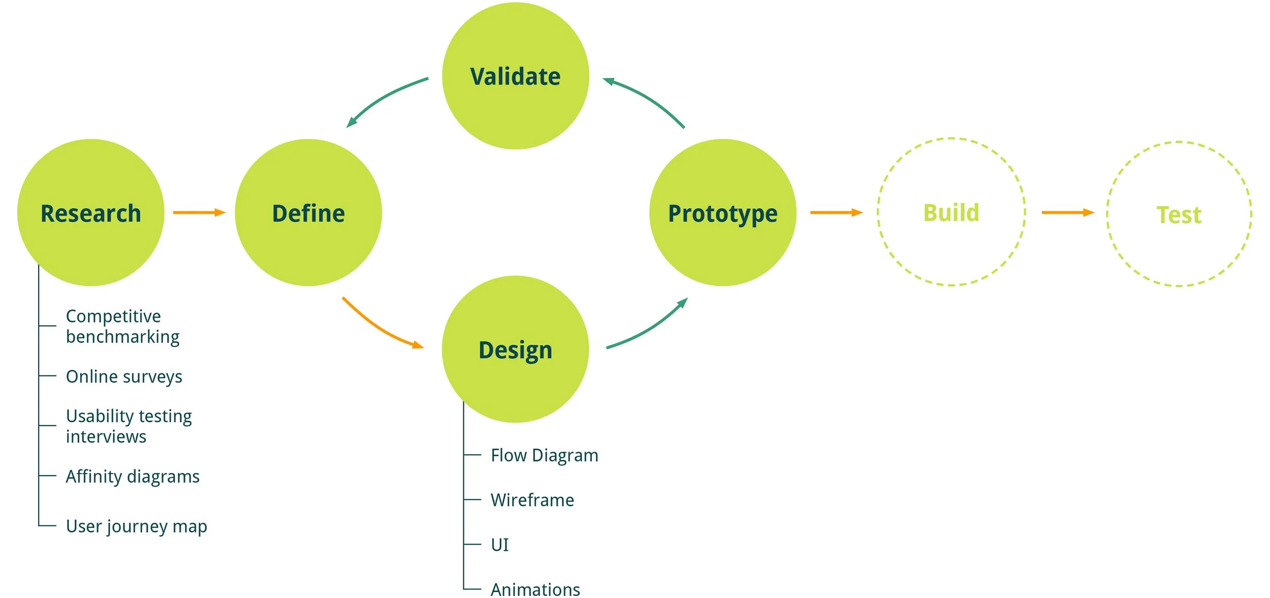
Online survey
02/10
I conducted an online survey using Google Forms, which was responded to by 20 primary target users. Gathering quantitive and qualitive data allowed me to observe any patterns and similarities in how people feel when using a flight booking app, and to identify the pain points.
SURVEY QUESTIONS
When was the last time you used an airline app?
What did you use the airline app for that day? E.g., check prices, book a flight, check-in, etc…
Were you able to complete your task that day? If not, please tell us why not.
Were there any points in the process where you felt stuck or had trouble? If so what were they?
Why did you use that particular app instead of its competitors?
What improvements would you make?
TARGET DEMOGRAPHIC
The app is primarily designed for tech-savvy frequent travellers in the age group of 18-55 years old. However, it is open to everyone who seeks convenient and cost effective travel options.
KEY INSIGHTS

IMPROVEMENTS USERS WOULD LIKE TO SEE
Show combined cost of both flights (outbound and return) as opposed to showing them individually
Improve the payment system efficiency by offering Apple Pay or Google Pay options
Allow flexible input changes during search, rather than having to restart from the beginning
Simplify the details of price packages, make it easy to read and understand
Enable auto login and keep personal details in user’s account
Optimise air miles redemption process
Show clear and accurate seat map, and prices for different types of seats
Competitive benchmarking
03/10
To better understand the usability of airline apps, I reviewed and compared four industry competitors: three airlines and one third-party booking app. The objective was to identify their strengths and weaknesses, address existing usability challenges, and uncover conventions and best practices that we should adopt.
Usability testing
04/10
I interviewed two target users and conducted usability tests on Ryanair and BA. I also reviewed two other usability tests on Aer Lingus and Eurowings prior to my research. In total four participants tested and shared their thoughts on four existing airline apps.
The usability tests allowed me to observe the user interacting with the apps and note their mental models, behaviour and pain points with the booking process in general. Detailed notes were taken during the interviews. The table below shows the key findings and insights:
Affinity diagram
05/10
I created an affinity diagram to review and organise the data collected from previous online surveys, competitive benchmarking and usability tests. This analysis was done collaboratively with two of my study partners.
FULL RESEARCH DATASETS
INITIAL GROUPING
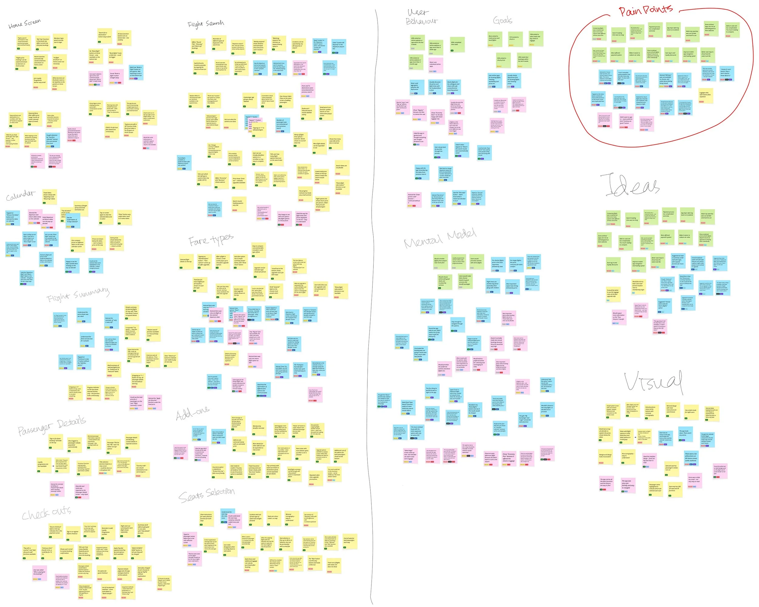
THEMATIC GROUPING
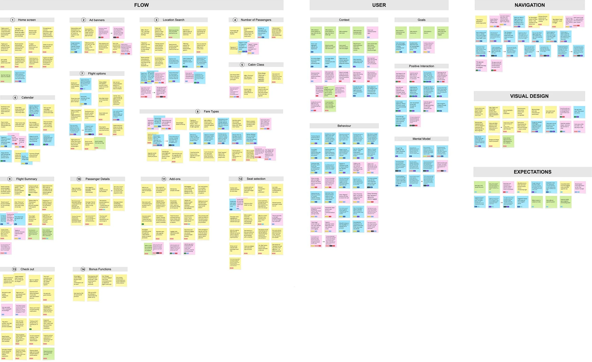
KEY FINDINGS
Interface should be simple and clean with minimal key information and clear call-to-action buttons
Structure and flow needs to be streamlined and simplified
Pricing and features need to be well-explained with upfront information
Navigation is expected to be visually intuitive
There should be no ambiguity around the cost of the journey
User journey map
06/10
With the structured data, I went through each step of the user's journey in the booking process and created a user journey map to illustrate their goals, thoughts and actions, positive feelings and pain points. I also used quotes from the usability tests to identify where Joy Air can improve their experience.
KEY FINDINGS
This analysis highlighted that “flight searching” and “fare type selecting” were the most problematic areas. These steps would need to be a main focus point when designing the Joy Air app.
User flow diagram
07/10
Onto the design stage, the first task was to map out the sequence of interactions between the user and the app. I tried to design the flow to be as simple and intuitive as possible, while addressing the pain points discovered from the earlier research. It illustrated the key decision points, actions and navigation paths, from the home screen all the way to the payment stage.
Wireframes
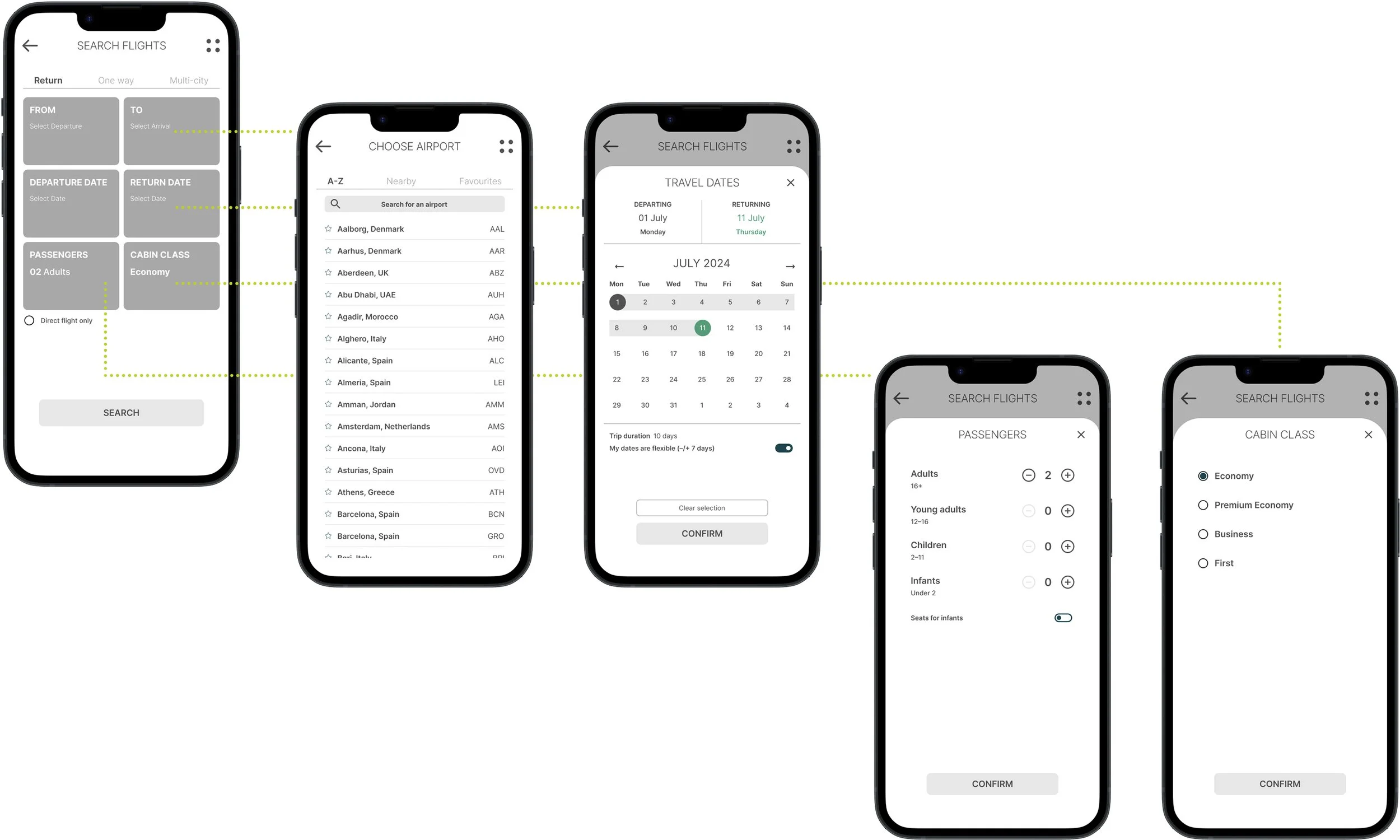
08/10
After mapping out the user flow, I used Figma to create these wireframes to establish the app’s initial structure and layout. These wireframes prioritized functionality and navigation, and served as a foundation for the next prototype phase where I could gather early feedback.
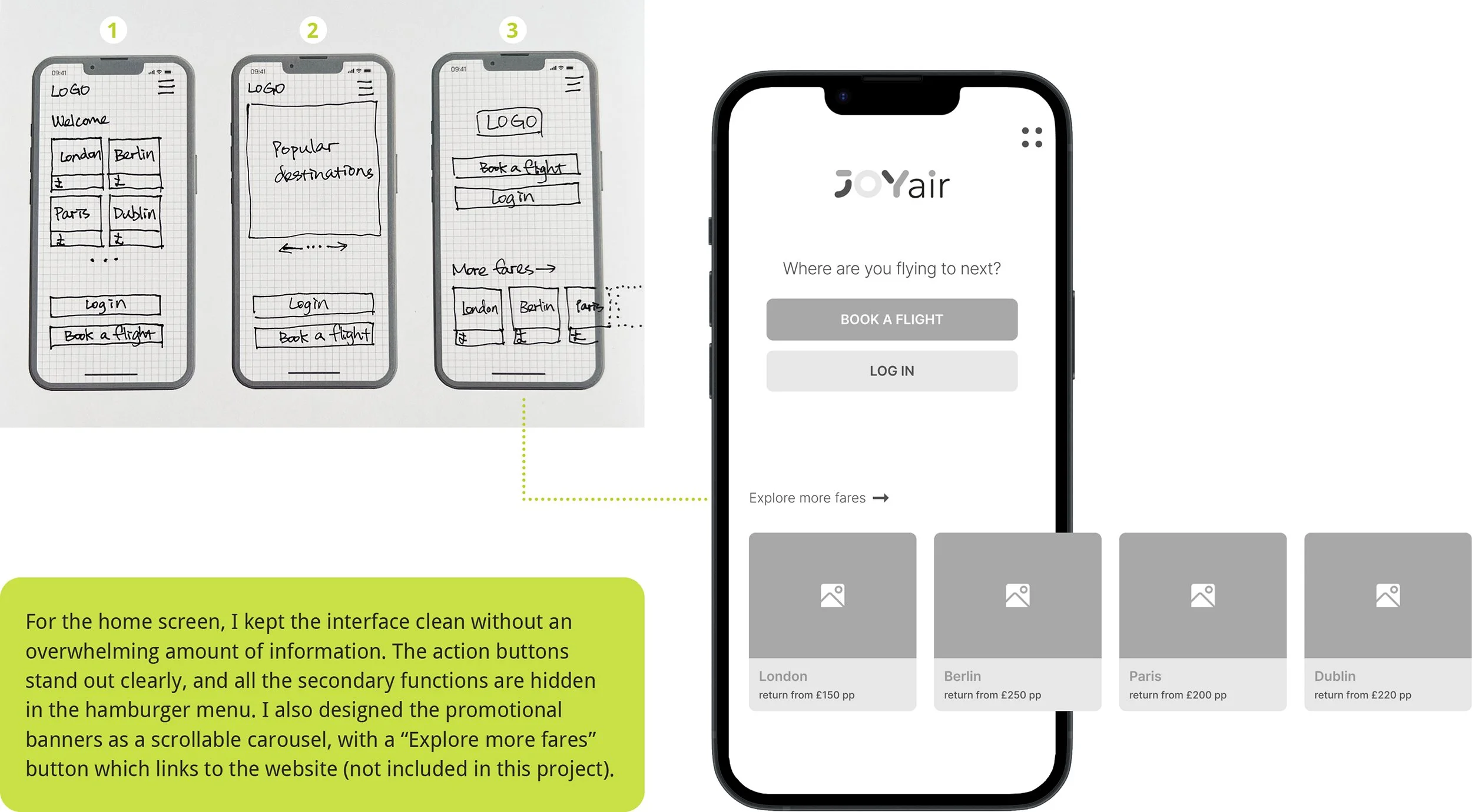
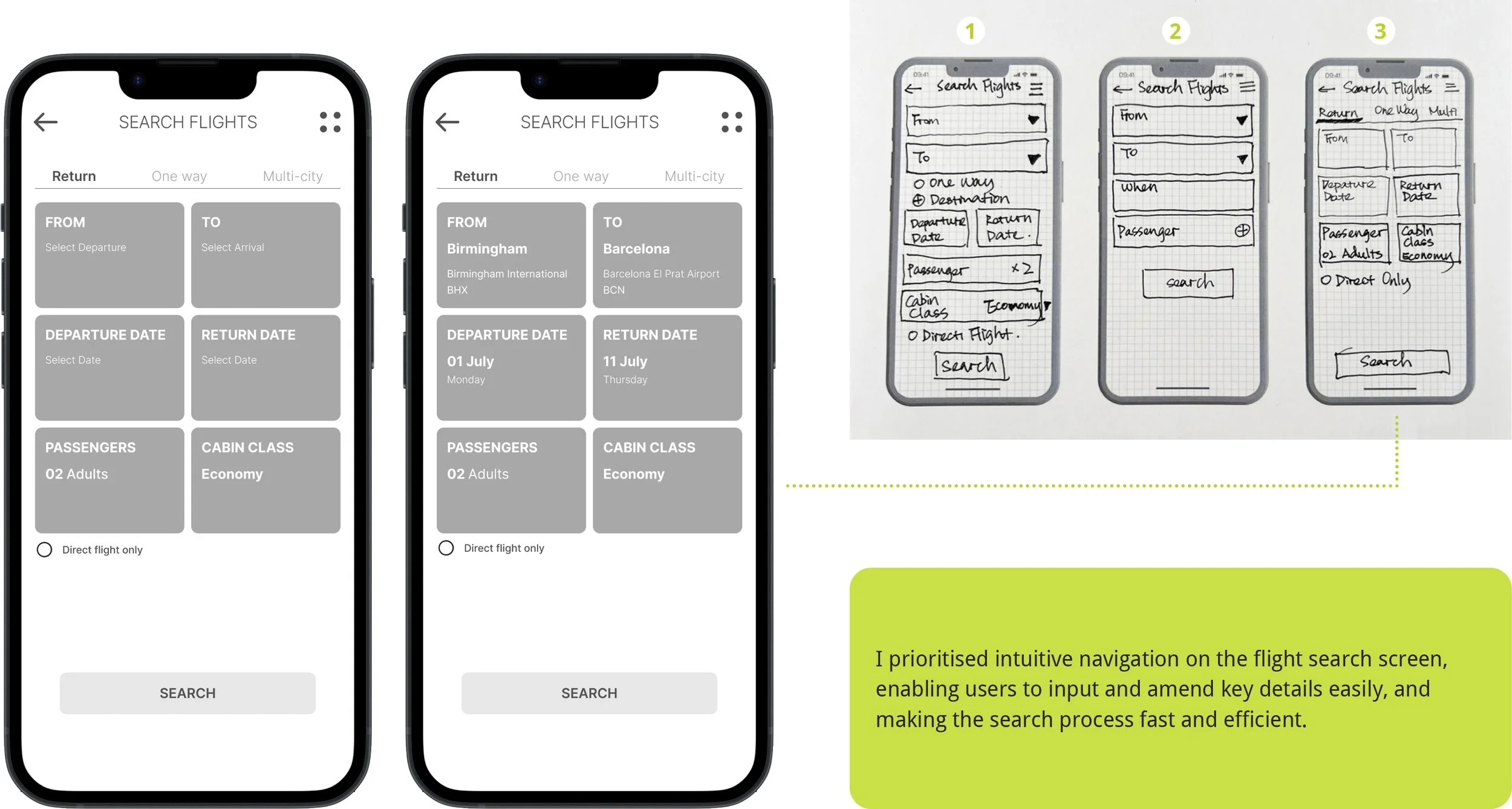
I started by sketching on paper. This helped me quickly test and improve my ideas, and identify the most effective solutions before making digital wireframes. The images below showcase some key stages of this process.
Home screen
Flight search screen
Fare types screen

Search result screen

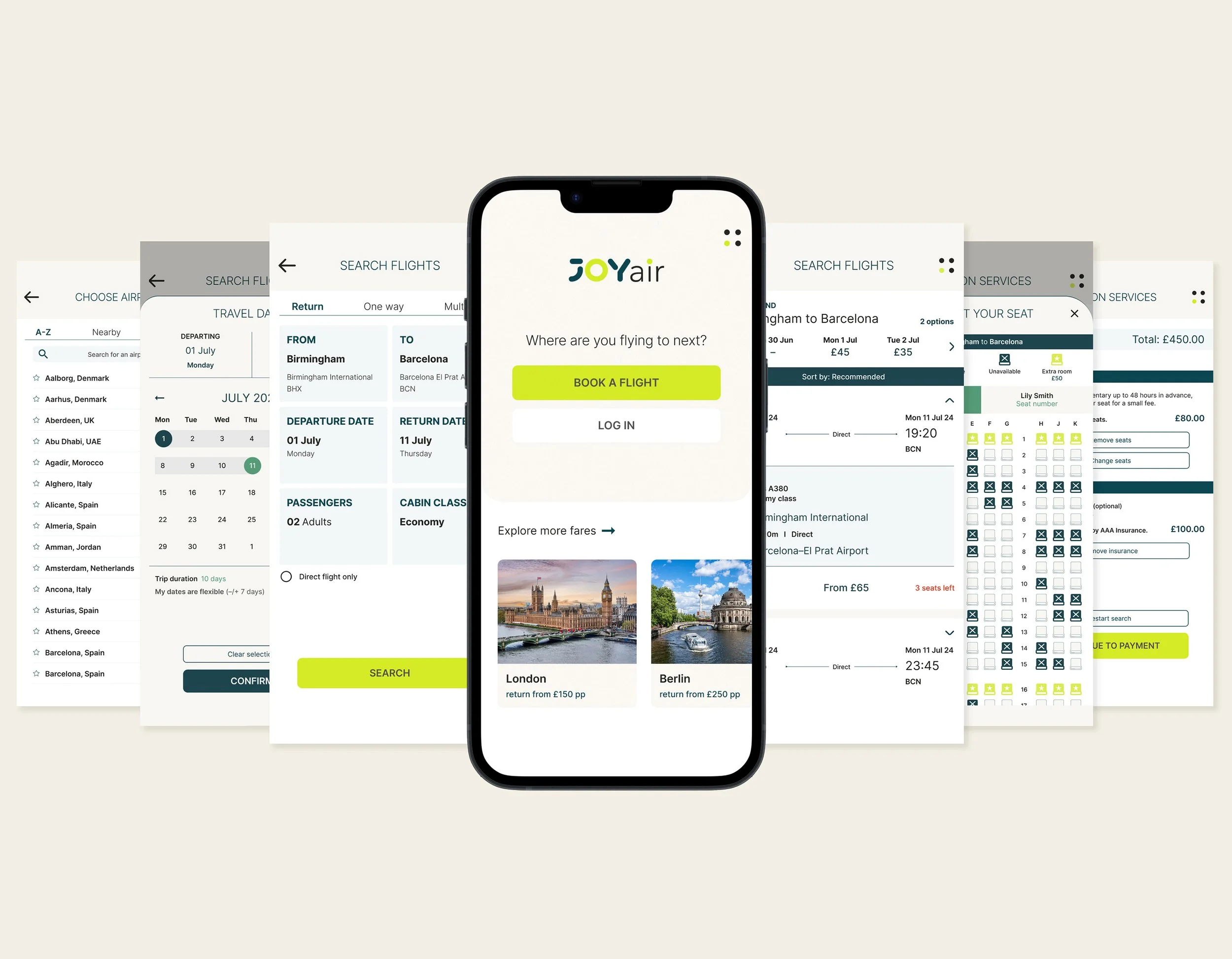
High fidelity prototype
09/10
COLOURS AND TYPOGRAPHY
Once the low-fidelity wireframes were finalised, I started applying colours and typography to bring greater clarity, hierarchy and personality to the design. Colours were used strategically to guide users’ attention to key actions and information, while typography improved readability. This step turned the functional layout into a more polished interface and made it ready for the prototype and further testing.
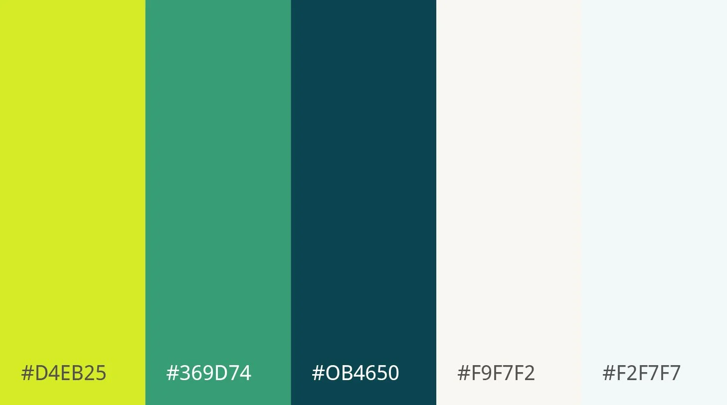
Primary colours
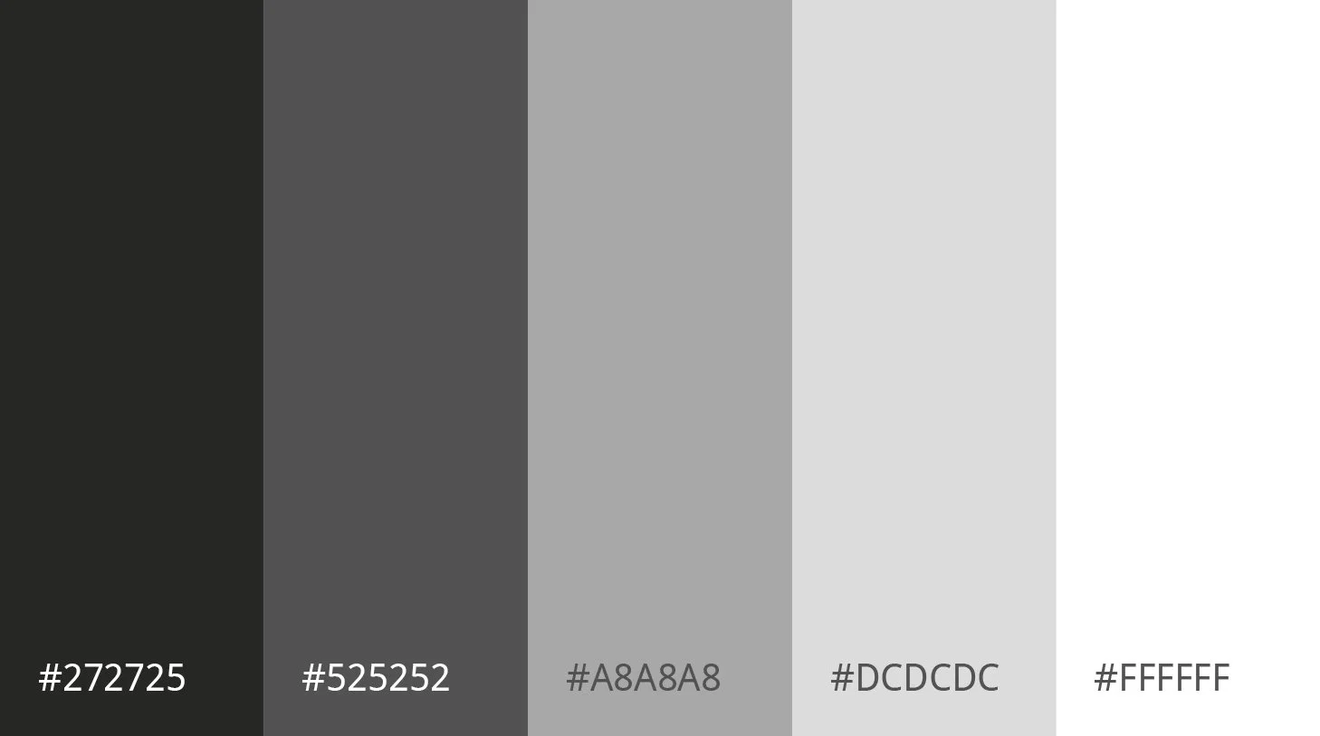
Secondary colours
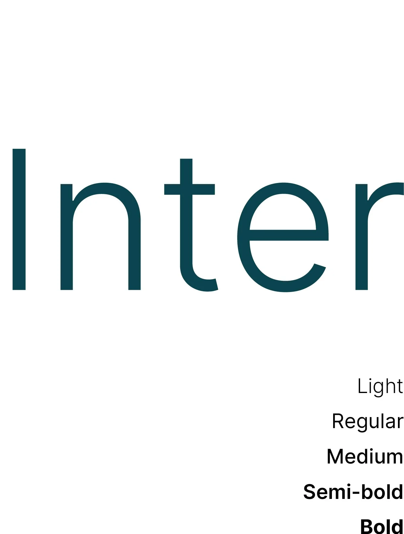
Typography
PROTOTYPE
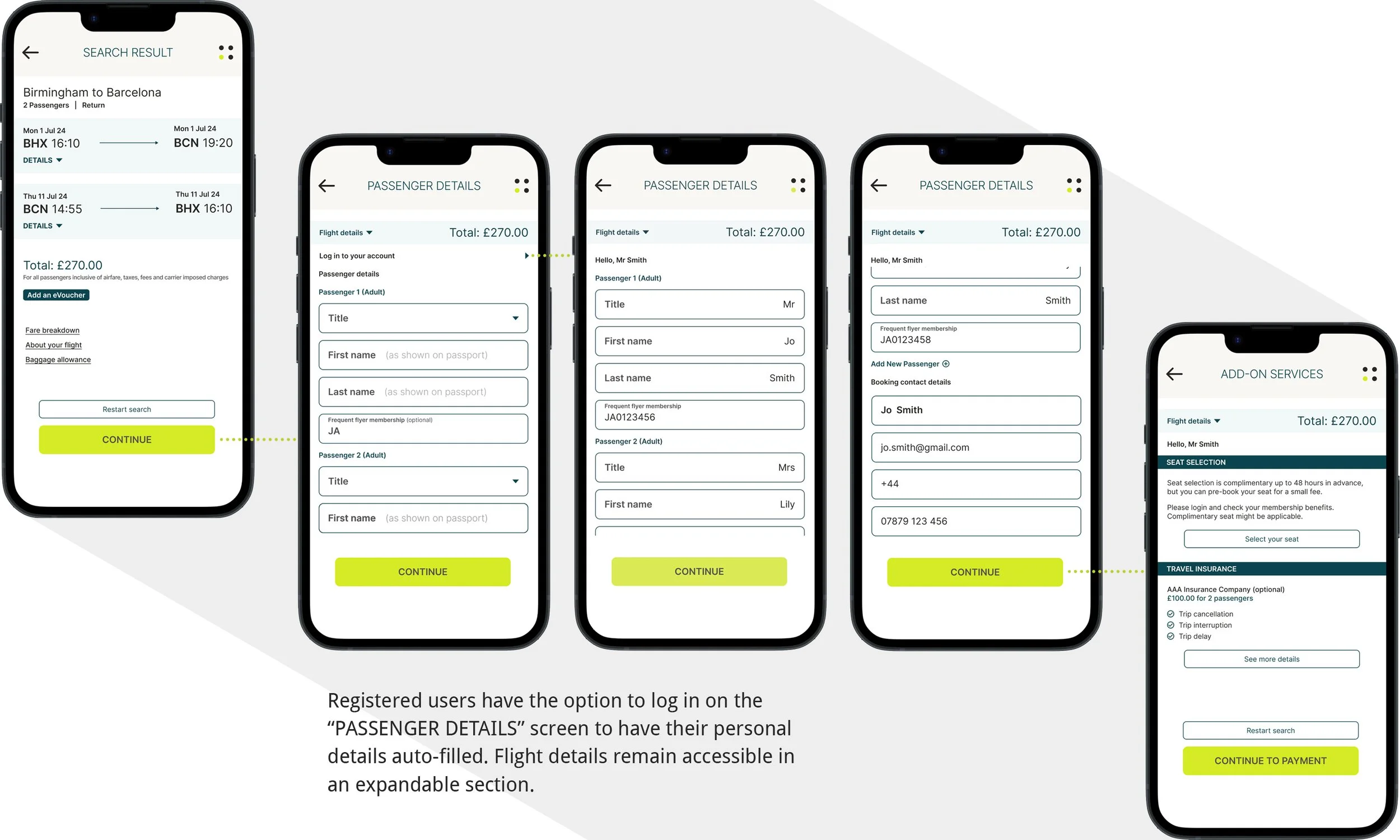
After refining the design, I created a high-fidelity prototype to bring the final concept to life. This prototype closely mirrors the intended look, feel and functionality of the final product, showcasing the visual design, typography, colour palette, and interactive elements. It served as a valuable tool for further usability testing and validating design decisions before development.
I broke it down into a few key stages for the case study to clearly show the process. Each stage highlights how the design solved the pain points uncovered during earlier research and testing.
Home screen and Search input
Login from Home screen

Fare type selection
Expanded details and restart function

Passenger details auto-fill
Add-on services

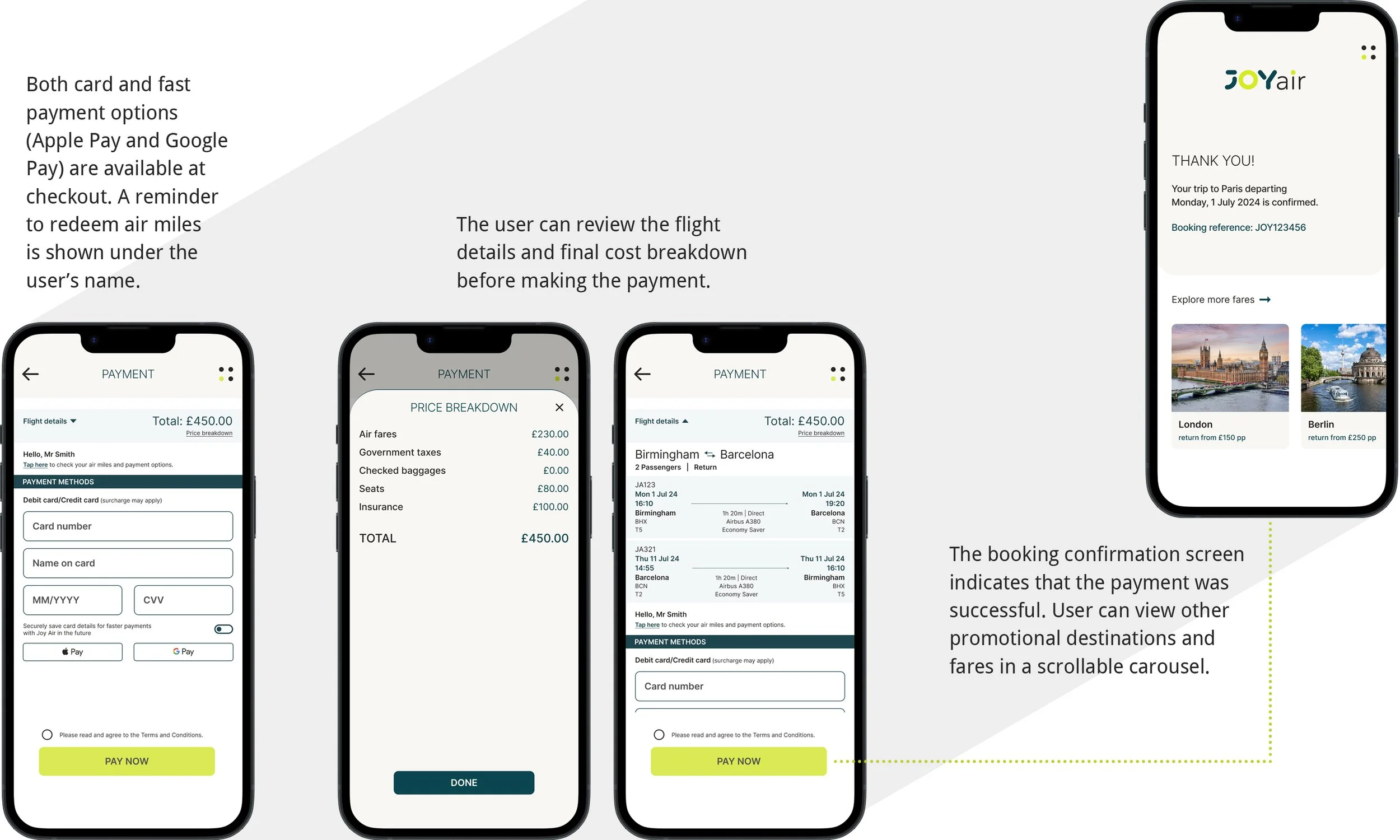
Payment
Testing and iteration
10/10
USABILITY TESTING
Once the high-fidelity prototype was completed, I conducted usability testing with four target users to gather feedback and refine the design before handing it over to the app developers. The testing primarily focused on:
Navigation and interface clarity
User flow during the “Flight Search” and “Fare Type Selection” steps
Effective communication of pricing and features
FEEDBACK
The Joy Air app design received positive feedback overall. Users agreed that the interface looked clean, navigation was straightforward, and the steps flowed naturally. They especially appreciated how information was communicated clearly and in an easy-to-read format, making it quick and simple to understand their options.
ITERATIVE IMPROVEMENT
One minor issue was noted: when users tapped their desired fare type, the app jumped abruptly to the next screen. They expected a confirmation step, such as a button, before proceeding.
To address this, I refined the design by changing the section color upon selection and adding a radio button to highlight the user’s choice. I also introduced “Select Return Flights” and “Continue” buttons to guide users smoothly to the next step.
Thank you for your attention.