Camping and Caravanning Club
Founded in 1901, The Camping and Caravanning Club is one of the UK's oldest and most established outdoor holiday organisations. Camping and Caravanning is the club’s monthly membership magazine, available in both print and mobile app format.
As the digital and print designer, my main responsibility was to design creative assets for the magazine across all multimedia channels, including print layout, UX/UI design for the app edition, social media, email campaigns, video editing and motion graphics.
The case study below is mainly focused on the latest redesign of the magazine and its app edition.
Project overview
01/06
ABOUT
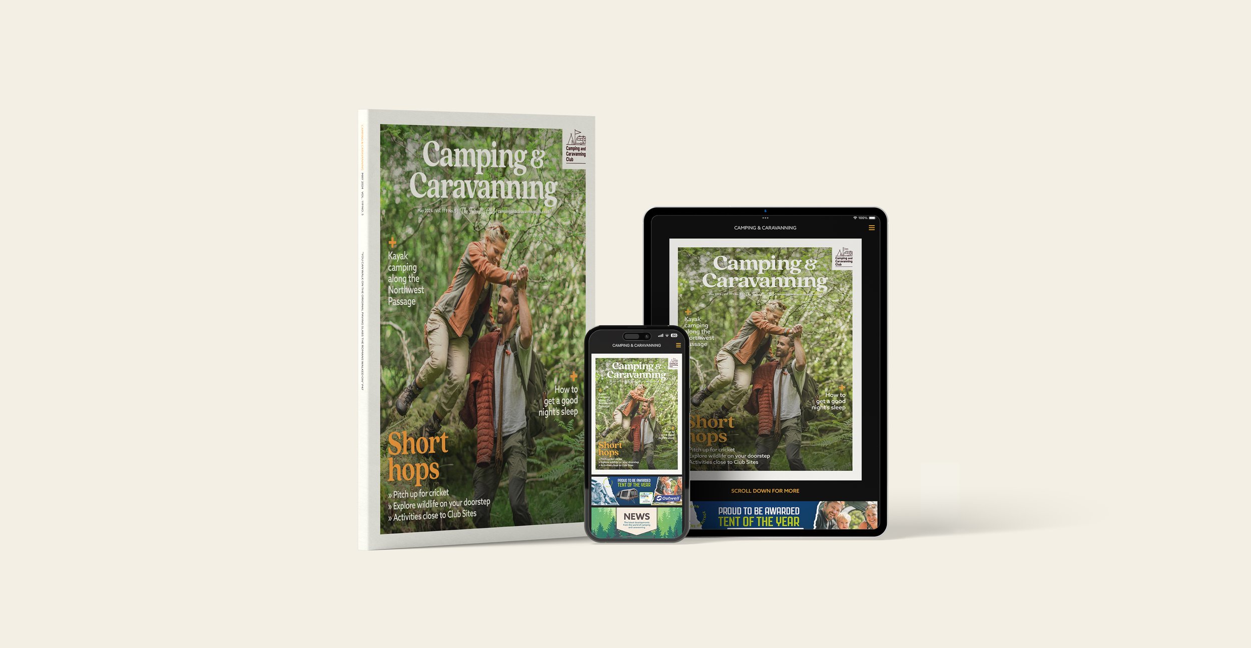
Camping & Caravanning is a monthly publication exclusive to Camping and Caravanning Club members. It is a key brand touchpoint and retention tool for the Club. It is available in both print and digital format.
TASK
With the introduction of the Club’s new strategic Brand Framework in 2022, the redesign aimed to align the magazine with the brand’s updated creative direction. There was also strong demand for an intuitive and visually engaging online reading platform, especially optimized for mobile devices.
Research
02/06
MEMBER SURVEY
We conducted a survey of 490 members for feedback on the previous design, to better understand what they enjoyed, what they needed, and how they would like interact with the magazine. This helped us create a better experience that truly reflects our members preferences and expectations. I created the affinity diagram below to organise the key insights.
Define
03/06
PROBLEMS
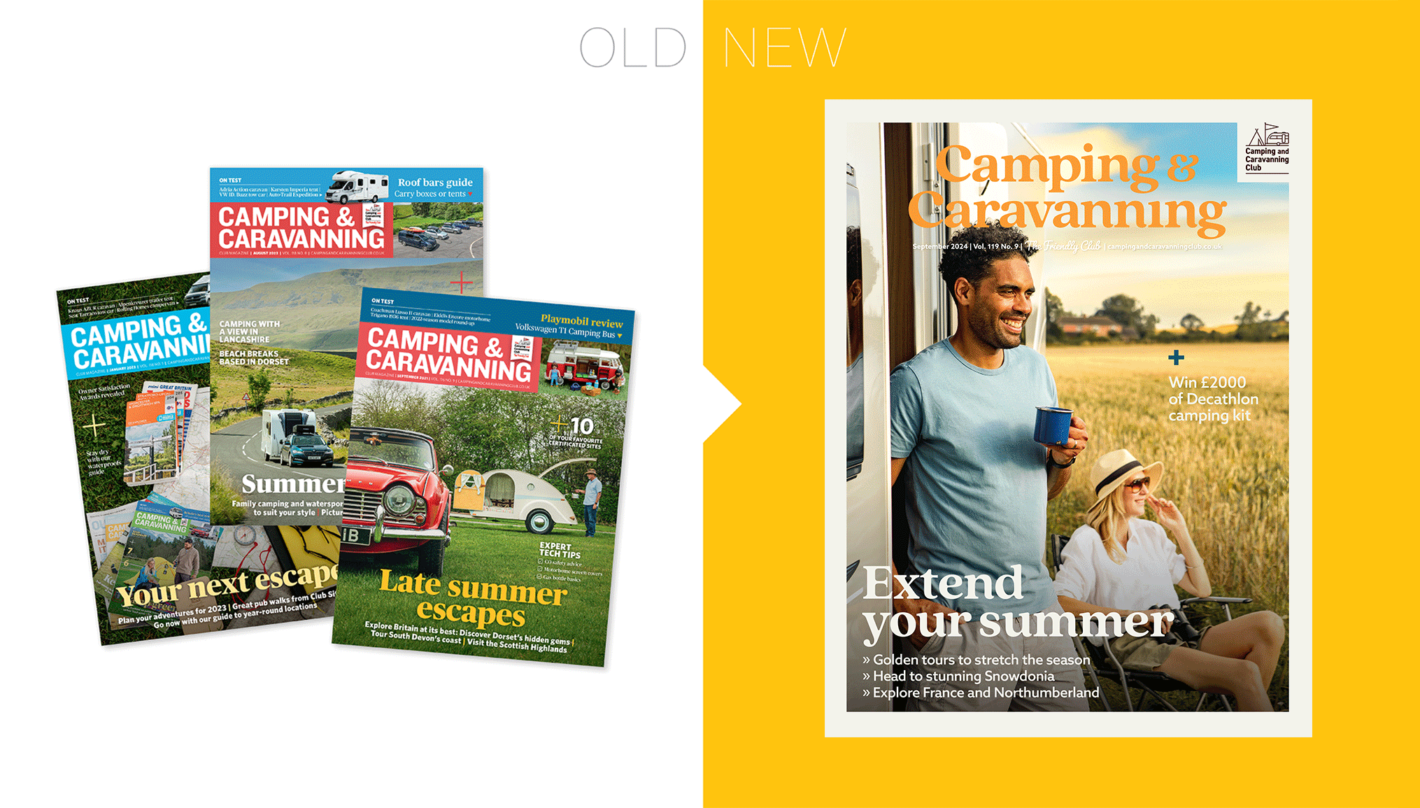
The design looked dated and text heavy.
A lot of the content felt too technical for the club members who seek for camping inspiration from the magazine.
Newer and younger club members are less interested in the Club news and events, but more engaged members still value this section.
Digital
The digital magazine was only available in a PDF page-turner format. It had poor readability on small screens, and lacked interactivity.
The navigation was confusing as the static pages were designed for a linear and tactile reading experience.
Video and interactive content appeal to younger members but the accessibility was limited.
SOLUTIONS
Refresh the look and feel with more inspirational imagery and modern fonts. Reduce text amount and let images lead the visual storytelling.
Dial down the weight of technical information. Shift the tone of the magazine from rational and exclusive to emotional, inspiring and inclusive.
Reconfigure the order of content to prioritise the lighter and inspirational touring features that the majority of members are seeking. Move the technical and Club news sections to the back.
Digital
Create an app edition of the magazine to translate static, linear content into a responsive, interactive and dynamic digital format.
Implement intuitive navigation (i.e. swipe for articles, tap to open sections, smart menus).
Add interactive elements like audio, video, or related content suggestions.
Print redesign
04/06

IMAGERY
We collaborated with experienced photographers and models to produce imagery that aligned with the Club’s brand identity. I provided art direction before and during the photoshoots to guide composition, mood, and styling. The visual tone shifted from technical and niche to a more relaxed, outdoor adventure-inspired approach.
LAYOUT
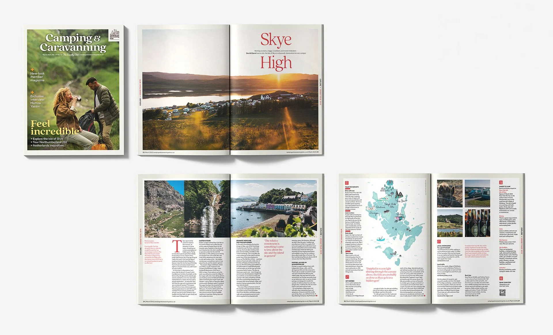
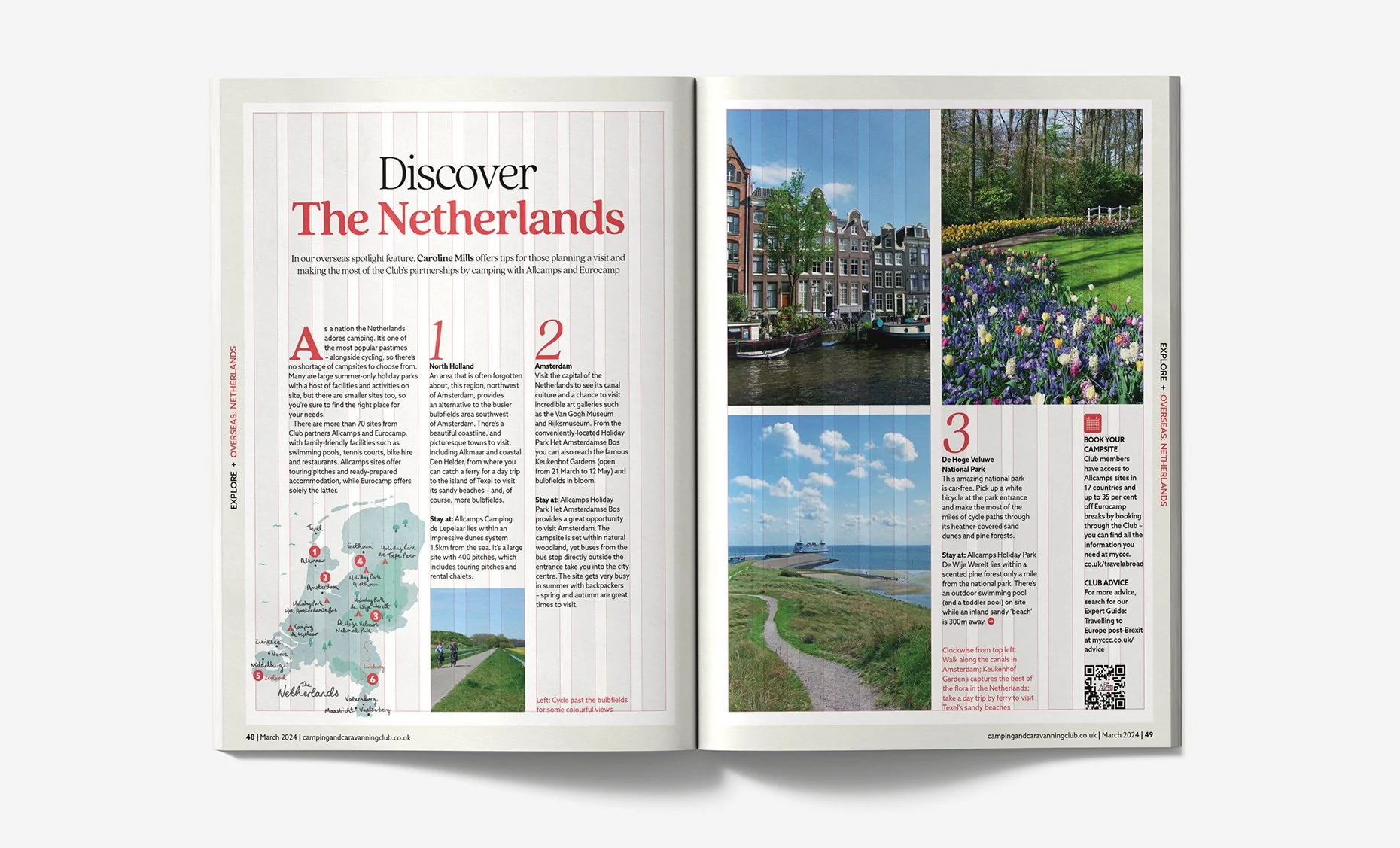
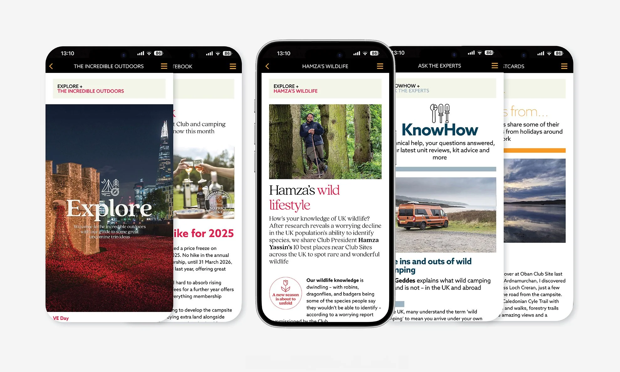
The pages now feature larger visuals and reduced text to enhance visual impact and make the content easier to read. The magazine is restructured into three sequential sections: Explore, KnowHow, and Connect, to create a more intuitive and engaging flow. A versatile 12-column grid creates structure while allowing for diversity in every spread.
Cover image
Feature layout
Grid
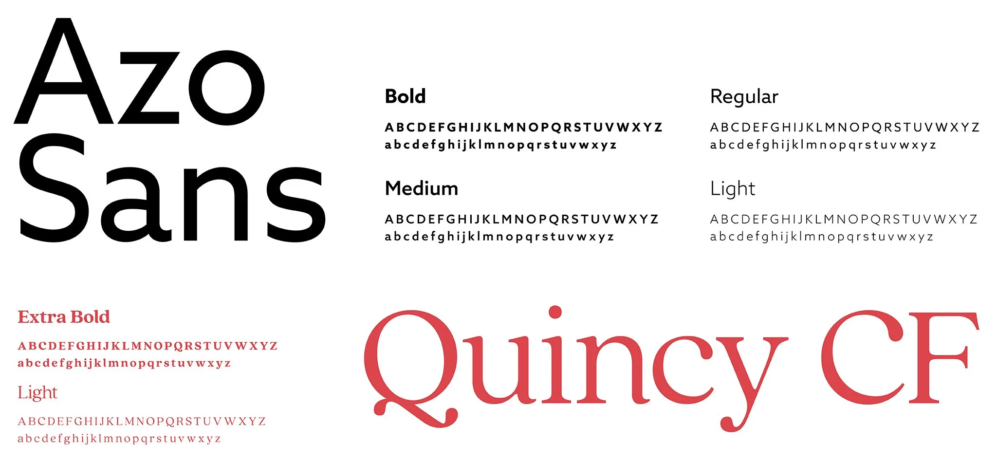
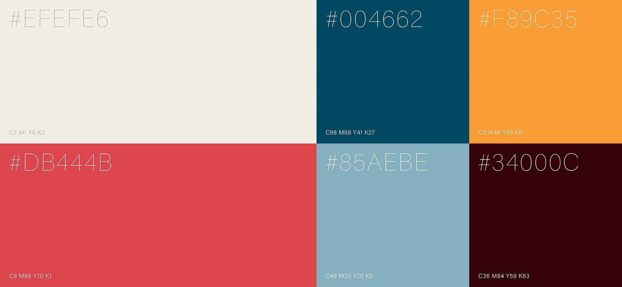
TYPOGRAPHY AND COLOURS
Refreshed typography and colour palettes were chosen for better brand consistency. Each of the three sections Explore, KnowHow and Connect was assigned a unique theme colour to enhance visual clarity. This approach was also extended to the app's UI design.
App design
05/06
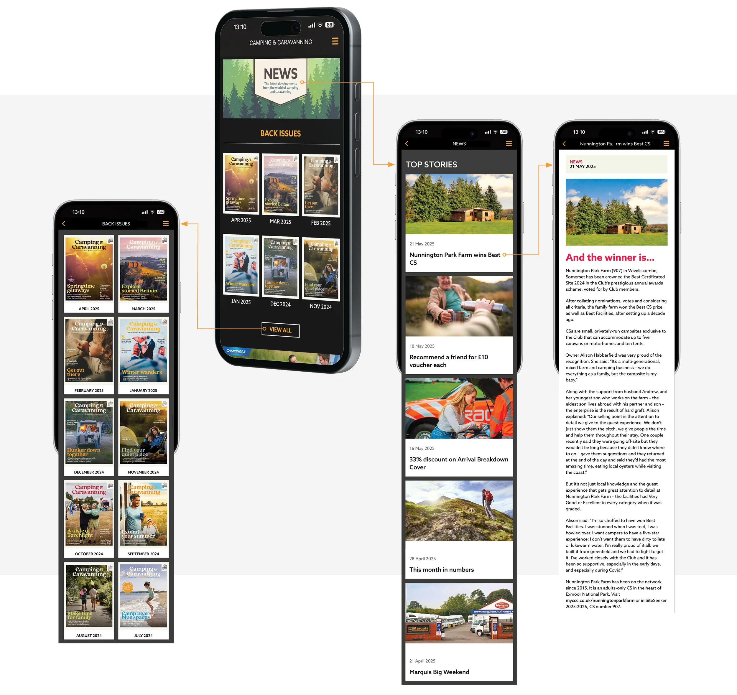
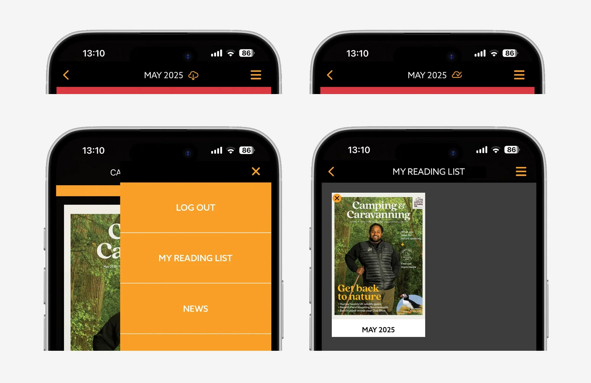
USER FLOW
The user flow below shows how a member moves through the digital magazine app, from launching it to reading the content. It begins with the onboarding screen, featuring the latest issue, news, and back issue sections. Once a issue is selected, the app requires the member’s login for the magazine content. The news section is accessible for everyone without login. The flow is designed to be simple and easy to follow.
WIREFRAME
I created a low-fidelity design in Figma as a visual guide, to outline the app’s core structure and user interface elements. Each article from the print magazine has its own card on the content level. Instead of flipping through physical pages or the PDF pageturner, members now can tap, scroll or swipe through content, with easy access to interactive elements.
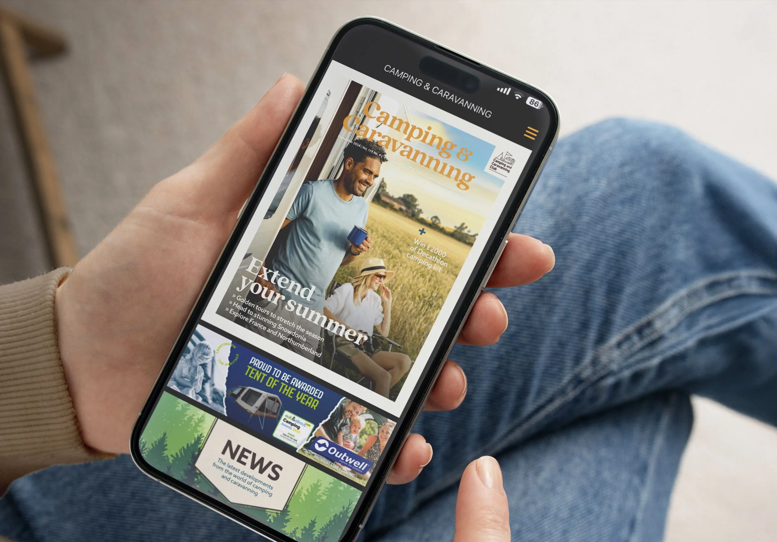
UI Design
The Club chose Twixl – a platform specialised in building and distributing apps for digital magazines, for the interface design. And Woodwing Studio to create and publish the digital content across multiple channels. Typography and colours were carried over from the print magazine to maintain brand consistency.
Usability testing
06/06
TASKS
Usability testing was conducted with six participants after 12 issues of the app edition. Participants were asked to complete the following tasks:
Open the app and tap on the latest issue
Login
Choose and read the articles in the current issue
Find and read one article from the back issues
Send a message to the Club
FINDINGS
I took detailed notes during the usability testing and identified key moments during the user’s journey. I then translated the testing data into a user journey map, to highlight key pain points and opportunities.
ITERATIVE SOLUTIONS
We went through the key findings with our app developer, and proposed the following possible solutions:
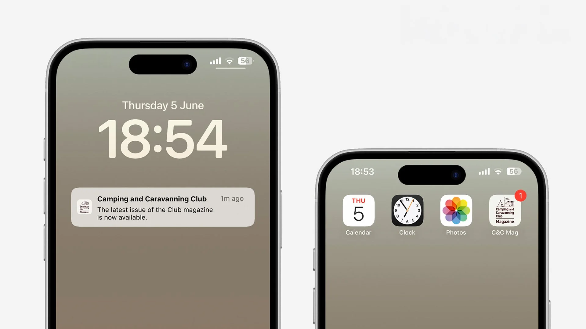
Send notification to users when a new issue is launched. Show badge notification on app icon when any new content is added to the app.
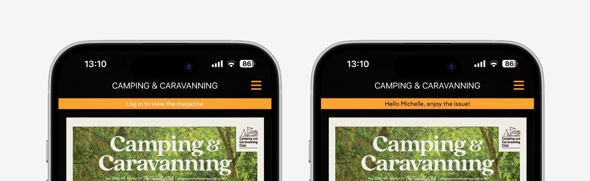
Add log in reminder, and show a greeting message once user logs in.
Create “Download the issue“ function and allow user to keep the downloaded content in “My Account“.
Enable “Category“ tabs and allow user to view previous content by category.
Notifications
Login & Offline reading
Feature category filter

TO BE FURTHER DEVELOPED
Some proposed ideas cannot be supported by the current system being used, or accommodated within the available monthly production budget. These will be addressed in the next stage of app development.
Enable interactive map for the touring features.
Enable “Keyword Search“ function.
“Live Chat“ function is not needed for now.
Thank you for your attention.